Client: Sole & Heal | Brand Refresh
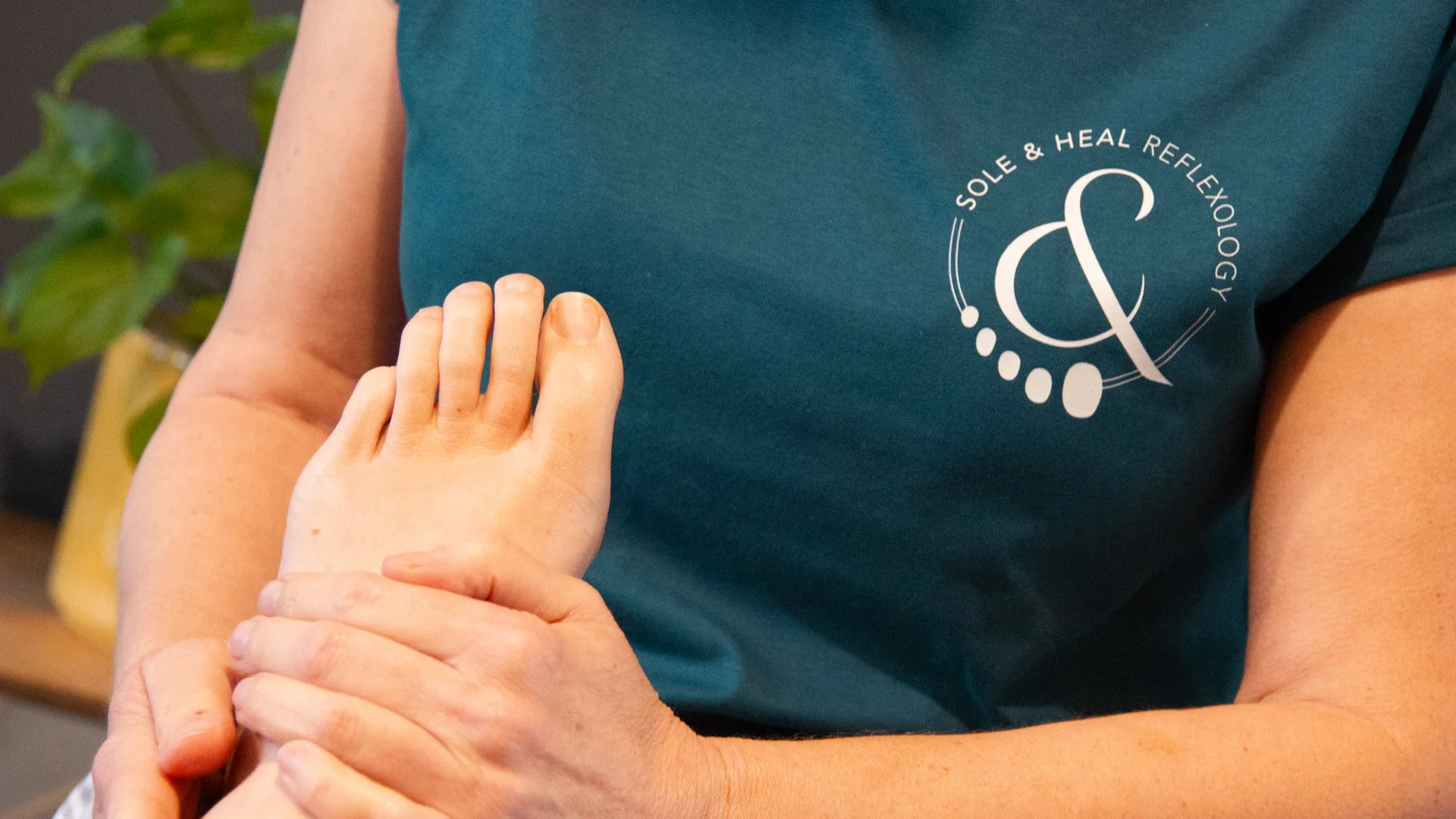
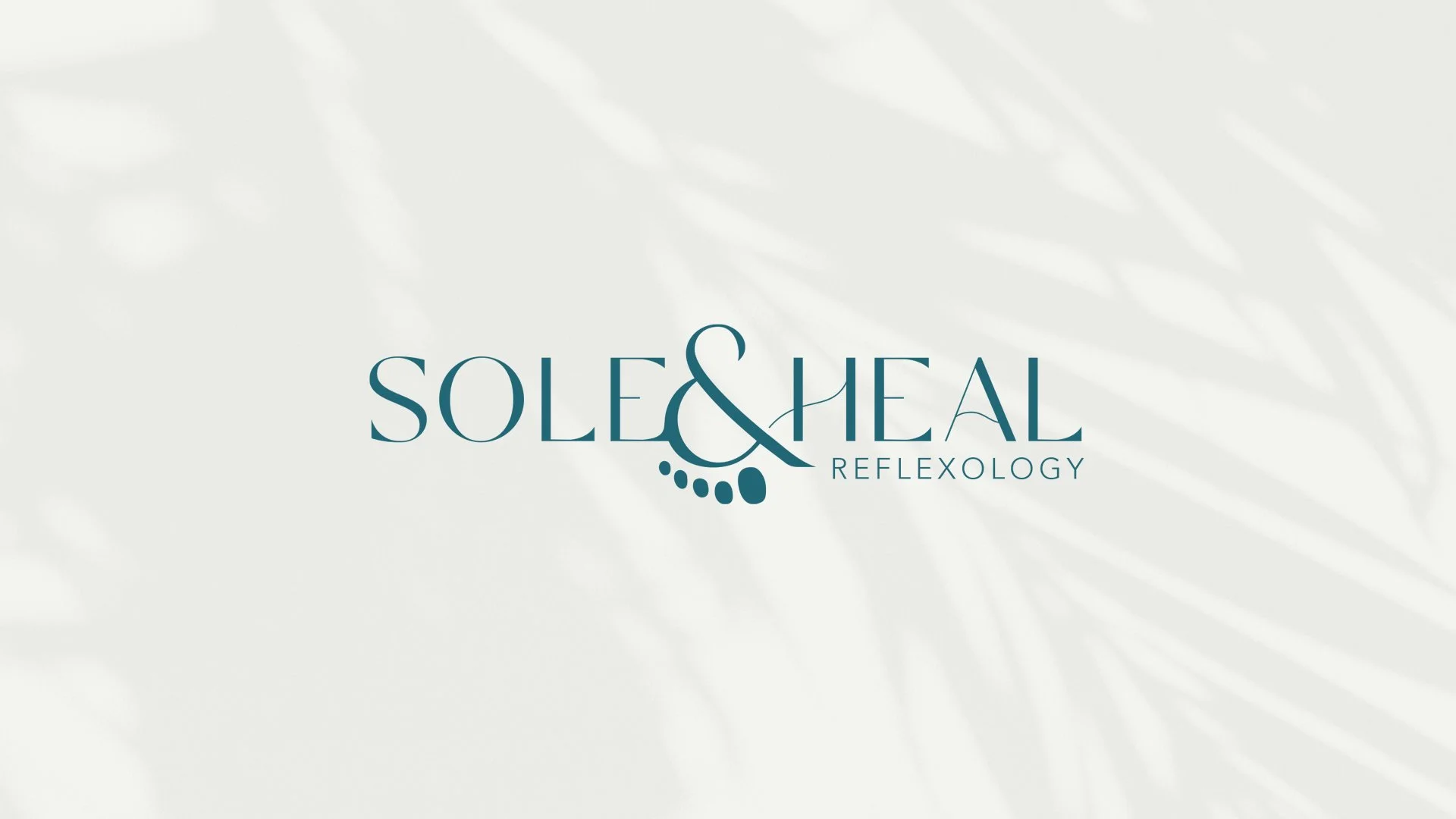
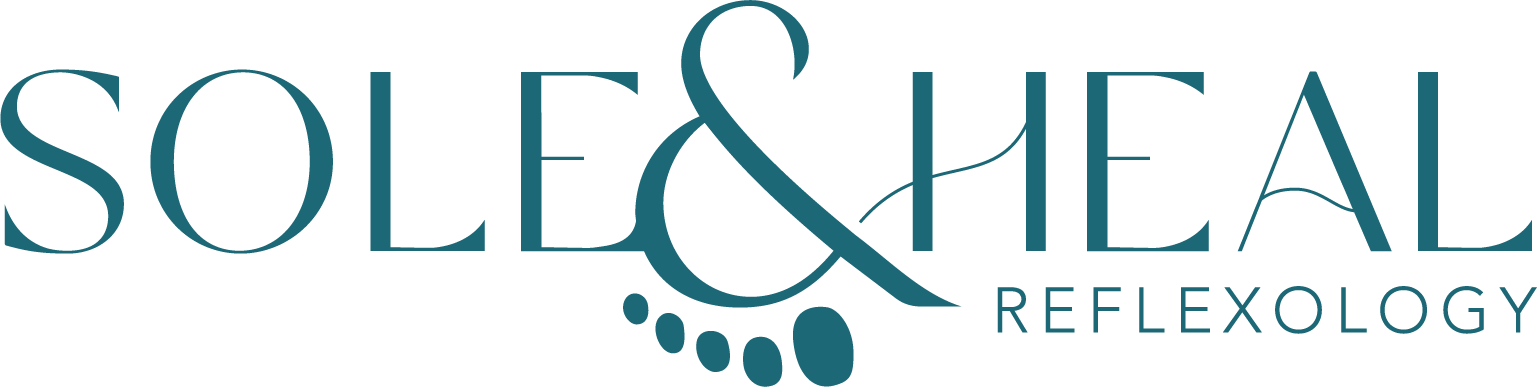
Maz already had a strong concept in place, cleverly using the ampersand as a foot. However, the execution felt quite clunky, with a heavy typeface and the use of black limiting its impact. Rather than starting from scratch, we chose to refresh the brand… retaining the original idea but elevating it with a more considered typeface and a refined colour palette. This allowed the brand to communicate more clearly and connect with the right audience.
Sometimes a branding project doesn’t need a complete overhaul and that’s where a brand refresh really comes into its own. It might be as simple as refining your colour palette so it better reflects your values and how you want to be perceived by your clients, or making thoughtful tweaks to your logo to more accurately represent your business and personality.
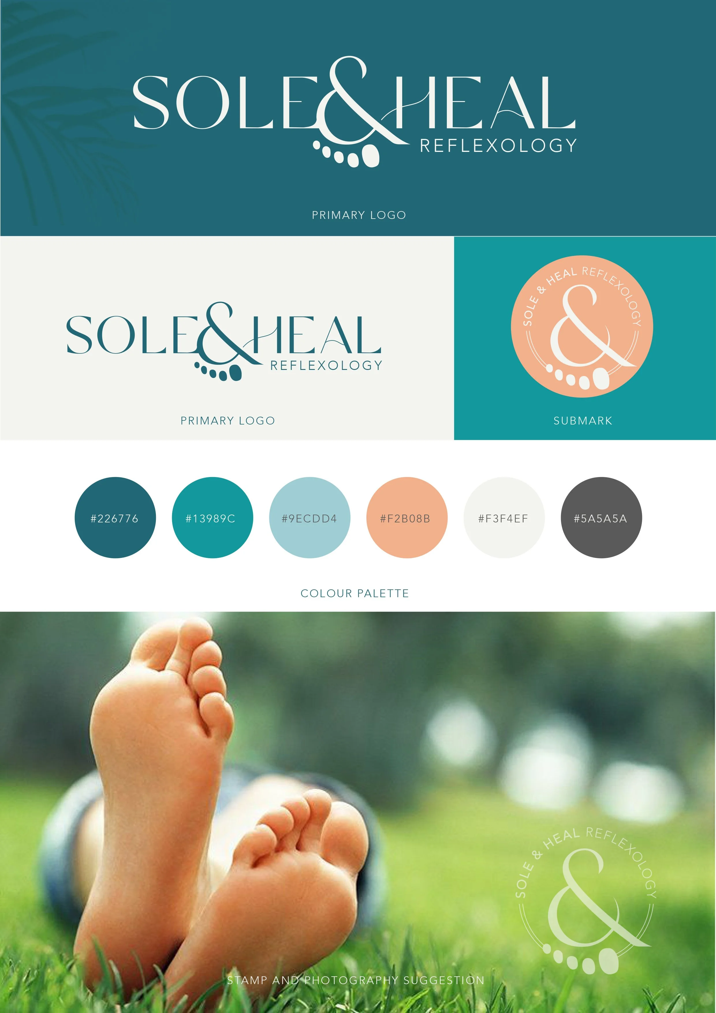
“The new version of my logo is something of which I am immensely proud. It is professional, unique, and I have not only one colour, but a whole palette to compliment my brand identity and to inspire my future marketing. Faye produced a mood board and helped me understand how to get the most out of my new graphics. Her personal and human touch reflected exactly what my own business sought to represent about me. Long may we continue to champion the creative human mind.”
Marion Reed | Sole & Heal